Friday, April 28, 2006

Color Art


Stained glass is a medium that artists use color to express nearly everything in their artistic design. While the wire metal stand supports the glass it is the glass that people are drawn to. Color does many things for a composition, it enriches as well as complicates our experience and communication with the image. Glass is an amazing medium in color because the only product artist have to work with is the actual glass. So everything must be perfect in glass all the way to their edges of individual pieces. There are no lines, like in drawing where you would be able to produce a gradual change in a colors value. Everything must be produced through individual pieces of glass.

Color is light and having the color on a lamp shade enforces that idea even further. The intensity of these colors on the glass are able to change. Because the glass is positioned by a light source the colors’ intensities rise and fall depending on if the light is on or off. So when the light is on the color approaches its highest intensity, and when the light is off the colors are at their lowest possible intensity.

This image has almost an all chromatic theme for the composition of color, not looking at the black metal. All the pieces of glass are about the same hue. However the value of the color changes in some areas becoming almost an orangish color. This idea is referred to the color additive or subtractive element in each piece of glass. This lamp shade has a beautiful color and the change in values is executed very well.

Blog Entry Assignment #6

1. After completing this blog, will you ever write about art again?
Yes- I feel that it is a good learning experience to be able to view art work and then put that information down in writing. By doing so I can concentrate more on my own thoughts about art, compositions or anything else. It allows me to be open with myself as I write thinking as I go about new ideas. Also when I write about art I am learning new processes in art and becoming exposed to various artists.

2. How often did you use Art vocabulary in your writing?
extensively- In every blog a wrote, I tried to tie in concepts from my own artwork or from ideas expressed in class. Some blog I accomplished this much more extensively than others.

3. How would you rate your personal research involved in this assignment?
Above Average- Each blog I posted I put a lot of thought into the images I choose. Once chosen I spent a lot of time looking through notes, finding information on the web about artistic themes I could uncover about each composition. I liked relating not only the work I was doing in 2-D with this blog but also ideas that I was learning about in my other art classes.

4. When writing did you ever use a dictionary or thesaurus?
Neither- However I did look up the vocabulary from assignment sheets as well as ideas that were in my notes.

5. Has your interest in new or different forms of art increased?
Yes- By writing these blogs I have been constantly trying to find good imaginary to represent different concepts. In doing so, I have become interested in many different meiums. One being photography, I was very impressed at how much I learned about expression and feeling.

6. How would you rate your overall vocabulary?
Average

7. How would you rate your vocabulary of art terminology?
Above Average- By looking up notes and writing in this blog, I have been able to retain more of the terms and concepts learned than what I would have from just being in class.

8. How would you rate your writing abilities?
Confident- I really enjoy writing especially when I comes to topics I enjoy, so writing this blog was fairly easy for me. I do sometimes worry that while I am trying to think about an idea and write it, the words I do write down do not appear how I envisioned them to look.

9. How would you rate your writing abilities when writing about art?
Confident- I like learning about art and by writing about it I am learning.

10. How would you rate your ability to use specific vocabulary when writing?
Above Average

Individual Concept


What is going on in this picture? Who and why do people establish meanings to things and how do they justify them? For example how is this image being represented? Are those people helping build something or are they going to throw that object somewhere else. Who decides what those holes represent in the side? Many ideas and terms are thought of by just viewing an object. Sometimes without really thinking and taking a closer look at an image. The level of education, history, memory, experience and interests are different things that help an individual establish a connection and view towards a piece of art.

This year’s art event was focused on the theme of dirty. When I attended the event I had not previously realized how many very different ideas there were about what the definition of dirty was. I saw several interesting concepts expressed deriving from these themes, physical, emotional, social, political, and economical. Dirty is just one word, what happens when a larger concept is expressed. Something larger like a specific war? More tension arises, however the audience is narrower. There are less people able to relate to the term. But instead using a big word that is very general allows so many people to become affected and have a view of their own on a concept.

In this piece I like to imagine the word help or struggle to create my own meaning. I I was given a more in depth description about the piece, I would not be able to be as creative and as personal as I would want to be.

Second Glance

When advertising, it is always very important that you address your targeted group of audience. To catch people’s attention, companies will often simulate imagery that reminds viewers at first glance of something else. Then to keep their attention on the image, the artist will create little details that hold the audience there maybe a little longer than if they had just previously thought the image was of something else. Another important step in catching people’s attention is by using similar colors to something else that people may relate with. Well know images like fast food logos and game logos are huge factors when it comes to catching a certain type of people’s interest.

This logo is for Google web search however it confuses people at first because they assume it is for game cube. Once the logo caught the attention for the viewer it held them long enough there that they noticed details that made it stand out. These details are what changes the image from being merely a logo to becoming something else. In this image it was something as simple as just replacing one logo for another logo. Ultimately an advertisement scheme that was handled very well. But some alterations in familiar imagery can hold a much more powerful meaning. For instance in a credit card project that I am doing in class, I am trying to recreate a credit card while changing the underlying meaning behind it. It is very important for me and everyone else trying to use a familiar objects to properly reproduce the image so it pulls of the astonishment felling in the audience. One that catch has been obtained I can them add my details to get across the point I am trying to achieve.

Blog Entry Assignment #5


Dorothea Lange (May 26th 1895-October 11th 1965) was a famous photographer of human forms. Her works are referred to as being a documentation of an era. Her photos humanized the tragic consequences of the Great Depression as well as influenced the development of documentary photography to what it is today. She started out as a portrait photographer having a studio in San Francisco. However once the depression began she left her studio and started paying more attention to what was happening on the streets. She spent much of her career studying the homeless, migrant workers and farmers. She was able to capture feelings of the depression through imagery of the poor and forgotten people of this time. But also in doing so, while showing hopelessness and despair she was able to also show pride and dignity of what those people endured under the circumstances. Once the second world war began she focused her attention on the relocation camps of the Japanese Americans. Many of these images were censored by the government and after seeing these events Lange did not agree with the government. She intended to bring up racial and civil right issue to the public put on by the intendment camps. Dorothea has paved away a path for photographers since her time. I am currently undecided in a career path in art. I do not know if I want to take a photography approach, however I do like using details and drawing human figures.

Dorothea Lange has made huge developments to the direction photography takes in today’s practices. She was one of the first people to be able to create a social documentary to the life they currently live in. She brought the struggle of the depression and the relocation to public attention. She even has some of her works censored by the government. In 1941 she won an award for excellence in photography called Guggenheim Fellowship. She has helped to capture the imagery of people’s emotions to educate the public.

I was really impressed at the level in which Lange went about in capturing the feeling of the people she encountered. Her most famous work is called Migrant Mother with three children positioned around her. She got this image from a migrant campsite and recalls her experience:"I had to get my camera to register the things that were more important than how poor they were, their pride, strength, and spirt." Lange was very determined to capture entire feelings of people. I was also impressed by all the close details she was able to produce. In this picture the wrinkles and the gaze. Many of her images have become icons for the era.


When I think about dominance in these images I thin about the feeling or the mood that they create. That is the overall goal that the artist is trying to convey. Dominance also plays a huge role in the human figures. For example in the migrant mother the mother is in center and is the largest making her dominant. The figure to the right the body of the boy is dominant the larger hands are subordinate and the individual whit fingertips of the boy act as accentuals.

The human form is the most important visual thing for all these images .Even though she is focusing on the human figure, Dorothea is most concerned about expressions and capturing the feeling and mood of the individuals. She allows all her images to represent as much detail as possible in the human form. The wrinkles in the hands and the folds in the clothes are excellent examples of capturing everything about the human form.

By viewing Dorothea Lange’s work I have gained a better appreciation and understanding of photography especially because this was mostly all done before the sixties. I am more intrigued now to draw and practicing capturing thought and feeling into visual imagery of the human form. I really enjoyed getting to see what was happening in a scene without actually being there in person. I feel like I should maybe look into taking a photography class because I am interested in the human form. Maybe this medium is where I can be most creative.

Unfortunately color was not an option when these pictures were taken. I wish however that it would have been because I would have liked to see how Dorothea would have handled it in her compositions. Even though her photos lack color I think I like them that way. By being only in blacks and whites I get a feeling of urgency and a better sense of mood. Without color I can really concentrate all my attention in looking at details and viewing expressions. Although these images lack true color they do have variances in shades. By indicating different shades I can better view the details in all the images. By having just the blacks and the whites I get a great sense of push and pull between objects in a single image. I also get a feeling of completeness this is almost psychological and relates to the temperate of the piece. In some pictures I fell sad when looking at them where others I see conflict. So I think overall I am glade that these images never had any true sense of color outside of value, because if they had I may feel like I lost some of the closeness feeling with the pictures.

Development of Color


Every artist that uses color must take into account how and why they use the colors they do and where they apply that value on the object. Even fashion designers must be able to relate how they are designing, creating and executing an idea from all the different stages of development. This design is a Jean Paul Gaultier dress. Things to be taken into account when this piece was designed are things like symbolism, pleasure, mood, meaning, dominance and temperature. Gaultier uses color to communicate the ideas and feeling needed to be expressed. Another important component is looking at the cultural aesthetical that will be viewed by the audience when looking at the piece. Designers need to create communication between the audience and the artwork.

This dress and overall design is centered on earth tones. Earth tones concentrate on various ochre and browns. They are able to react with other colors the way that greys do. Which means they mix well and are able to create a wide variety of different values. This theme works very well with the model’s skin tone. The dress is a goldish ochre color while her skin is a little darker but resembles the color on the dress. The gold bracelets on her arm accent the overall image of color. Every component in this design plays off one another giving a nice earthy effect or feeling when viewed. This idea can be described as the temperature of the artist’s work. Temperature is described as being the psychological heat that is generated from the color. This earth tone design was executed very well with the body of the model adding accentual colors.

Thirsty


One of the main components in advertisements, are the different uses of color. Absolute Vodka is a company that greatly advertises its product in a very artistic way. There are hundreds of different advertisements for this product. I have see objects arranged around a bottle as well as images where the product itself has been manipulated in some various way. Ways that could possible persuade a consumer to buy the product for reasoning behind the advertisement. For example an advertisement where the bottle is made up on different colorful flowers, this ad would promote the idea of spring and be more generated towards the female audience. In another ad the bottle is placed in really refreshing cold looking snow and ice. The bottle was designed to blend in with the surroundings in the background, I feel that this advertisements would appeal to people who were very thirsty at the time of looking at the ad. In order to produce an effective advertisement, a company must look at its design qualities and projected consumer groups interests in doing so.

This advertisement focuses on the color of the text and bottle to create a memorable effect on consumers. The idea behind these colors is complementary hues. The yellow text complements the purple text on the parallel bottle in the center. The yellow color is then dispersed to the lower level of another bottle and pulled up into a red. Then there are thrown in different areas, shades of blues and oranges. These colors flow nicely with one another because they are split complementary. Advertisements sometimes rely heavily on the use of color.

Ronald


Art is not only specifically geared to the intent of being put in a museum setting one day. Art can be produced just for the sure pleasure for making the piece, advertisement, entertainment but the most thought provoking may possibly be art activistism. Art activism demands the attention of the viewers to get a point or and issue across an audience’s perspective. All different groups of people protest or promote their ideas for different causes. In some ways these artists are working harder with their work, they have to capture the attention of the general public or their projected audience. Activists are very passionate about the beliefs they hold and what they hope to accomplish. Whether accomplishment means providing friendly knowledge to individuals or maybe something bigger like changing the government or the way we live our lives today. Activists must be able to inspire others.

This picture is from the 2003 Ronald McDonald tour done by the group known as NATO. NATO stands for Northern Arts Tactical Offense. This protest deals with the consuming world we are in today in the United States. United States capitalism is forcing itself to all areas of the world. NATO choose to display this idea through a single corporation, McDonald's. The entire movement was done troughout England I bealive. To check out more photos of Ronald on Tour visit www.beyondtv.org/nato/dec/nato_ronald.html Art activism in very subversive sometimes and must maintain powerful imagery in order to attact and hold the intrest of the public.

Light vs. Evil


This image represents a good example of the art term chiaroscuro. Chiaroscuro is used to describe the artistic devise of using light and dark values in order to express depth and volume. High values are present on the right side of the woman’s face as well as her upper body. The highest value in the composition is the light in the background behind the dragon image. This value because it gradually gets brighter towards the center appears to be moving towards the audience. It is positioned in order to appear like light shining through an area and moving inward. Not quite as high of values but still bright lie in the details in the dragon’s body. Especially in the area near the foreground. The dragon is very dark in color value blending in with the very dark background that surrounds the images in some spaces. The light details act as accents for the image. On the woman there are dark accents opposite of the ones on the dragon. This contrast a represents figure ground reversal technique. The value of the different values is also apparent in the composition. The blue hue in the background is the most noticeable example. The outer edges of the object are darker, whereas as the eye is drawn inward the tone of the color changes. The more closer in the center the more white the color become. This change in color is another reason I find it to be the focal point in the composition. This area is complemented by the head and bust of the woman in the foreground. Both these objects seem to come forward in space. The lightness of them is also symbolic. Light represented to goos and dark representing evil. The light in the background is in opposition to the very dark background that surrounds all the imagery. These color plays are used to address good verses evil to the viewers. This image is very dark but yet it is still very light at the same time, so I believe that the composition represents chiaroscuro very well.

Movement by Exaggeration


Exaggeration of compositional elements compels the audience to gain more interest in a piece of artwork. Look at how distinct the line movement is in the water on the right image. We get the feeling that the water is very strong and is in a direct path of motion. The image on the right has lines that are not found in nature. The lines are emphasized and draws in attention, becoming the focal point in the composition. In both these images the water appears to be very rough, and that idea has been expressed well because of how much the lines for the water were exaggerated.

These images also offer depth in their composition. The one on the left has apparent figure ground reversal. In the foreground are figures and this area is darker. The people and the land are darker than that of the objects in the middle ground. The white lines in water are thicker and much more exaggerated than the one in the back and foreground. The background once again becomes darker, more of that in the foreground. In the image on the right the foreground is dominant, with the movement of the water being represent. The middle ground acts as boundaries for the composition. So an idea of containment has been achieved. Allowing a unified force to be created for the composition. The background in this piece contains the accentual parts of the image. The birds are important in setting the mood for this piece, however they are not as important as the movement of the water in the foreground. Depth is an important component in theses two compositions.

Setting a Feeling


This photograph provokes a strong heavy feeling, almost a feeling on sadness and longing when I look at it. Being able to establish a mood or feeling when looked at demonstrates a strong composition. The feeling that is associated with the image when looked at creates a lasting impression in the viewer’s mind, making it memorable. The use of color is what strongly impacts the reason why I feel this image is sad. Because of only using values of white and black, I get the feeling that this image is supposed to represent a memory from the past. Having the front chair in the foreground be white, draws the attention there. This white chair is also the dominant structure in the piece. The extreme white that is represented in the chair is also expressed again in the windows. This pulls the attention from the chairs outward throughout the composition as a whole. The use of not using color is what makes this piece so memorable.

Chairs have almost humanistic qualities, by having legs and a back and because they play an important role in our lives every day. So from the image I feel sadness even though I am only witnessing how a chair is positioned in the composition. I feel that the chair is looking out remembering an earlier experience and longing for it. Maybe even questioning past events. This image definitely demonstrates a story of a place. There is something that is very specific going on here that viewers are able to connect with. While no exact event comes to mind when looking at the composition, it leaves the viewers with the mind set it provoked. Making the audience reflect on an experience they encountered sometime in their life.

Thursday, April 27, 2006

Appeal


This image from the game Final Fantasy demonstrates a very visually pleasing composition to look at. I find the details to be what helps to make this piece so engaging for the audience. The way her arm is vertically centered in the composition is appealing to me. Surrounding her arm are various vertically positioned lines making up the stained glass in the background. Helping to bring focus to her arm are the two circles in the glass. The edges of each one meet at her arm. Her hair continues to create this downward vertical movement to the composition. The artist wanted to give the feeling of movement in this piece. But not wanting to loose the attention of the viewers, added the leaves. By having these leaves the image no longer feels like it is leaving the page but still it mantains the feeling of movment. The leaves make a lighter feel to the design, almost of contrast to what is happening in the middleground. The way the figure's arm is represented demonstrates strength and power. I think the leaves give a different feeling. A feeling of soft, lightness, almost a quite peaceful appeal. There is a lot of detail that helps to create this image's appeal.

I feel the this composition's meaning is also effectivly executed through the details shown on the image. The clenched fist and straight arm are good indications of of a literal face value of streghth. The leaves I feel are symbolic to a deeper meaning. A possible swiftness and smothness, a feel that is much less threating than the figure's posture. The use of color in this image is as well an attribute to the compositon. The multi-color in the stain glass softens the overall image.With out the stained glass there the difference between the girl and the leaves would be very rough. So visually the glass adds a feeling of balance making the image not as literal purhaps. The value changes on the leaves also make up part of the compositions appeal. There are many visual attributes to this piece that help to hold my attention.

Balance


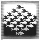
Balance is a key component in creating good pieces of art. A composition must be able to unify itself and all the components of the image as well as be able to create some variance in some area of design. Gestalt is a term that sums up the theory of design principles in art. There must be some sort of design in able to establish a well put together image. The six principles of Gestalt are grouping, containment, repetition, proximity, continuity, and closure.

This MC Esher print uses several different elements of gestalt to get the overall effectiveness of the piece. The most noticeable principle is grouping. I first notice two groups one being the birds the other fish. Not only are these images separated this way by group, but color also acts as a way to separate the two groups. Within the two groups is repetition, the same images is being represented multiple times. By the birds and fish being the same size and scale, they appear to almost blend together creating a greater use of repetition. Even though the two different groups create variety in the piece, which helps to create the balance, they still provide a fluid connection among each other. This connection leads to the idea of continuity which adds movement across the page. My eyes are unable to focus on one single figure, instead I am pulled around noticing images between images. This unableness to fucus is due to the fusion the images create with one another. The two different figures are so alike and they share common edges which even greater fusion is achieved. The grey border around the smaller figures acts as containment, not letting our eyes wonder off the page. This print crates an extreme balance between unity and variety.

Visualizing Ideas


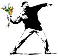
When an idea is expressed in a visual form there needs to be a meaning that can be understood by an audience. Having individual ideas expressed and understood by an audience is what artist strive to achieve. Being able to hold an audiences attention whether it be visually or maybe conceptually, for instance making them wonder and think, is what every artist hopes to achieve with each piece of artwork. When thinking about how to get an idea across to an audience, the artist must take into account terms like language, iconography, audience, immediacy, stereotypes, cliches, and elements of surprise. Art is not all about visual components, engaging others and expression are almost more important than the work itself.

This image takes a few different approaches to expressing the meaning that lays behind the work. The man getting ready to throw the flowers looks to me like an anti violence protest image. At first glance I get the feeling that this picture is a flower advertisement, it reminds me very much of a Ken’s Flower icon that I would see on a side of a building or on a van driving down the road. But after I look at it closer I realize that the figure has a cloth over his face and instead of carrying flowers looks like he will throw them. The man ’s stance looks like he should be throwing a bomb, which leads me to violence or a war/ raid idea. By incorporating the flowers I fee that the image now has become a protest or maybe just a statement about peace. By having the flowers in color I am more drawn to them then the figure, emphasizing more importance on them. This image is done by the artist Banksy and I believe he created meaning very well by playing with the audience own ideas. He used flowers which are symbolic, and he connected other feelings with these ideas. Psychological plays on the mind were important in creating an effective piece like this one.

Learning Art


An artist is a creative person, who takes charge of their ideas in order to form new expressive visual forms to explain their ideas. Methodology is an idea of different practices, procedures and rules people use when they make work. For instance how an idea is processed and how an image is ultimately chosen for a design are examples of methodology. Artists are constantly creative which explains how and why they come up with the ideas that they do. In some sense they cultivate creativity by following these principles in their lives receptivity, curiosity, connection seeking, having a wide range of interests, attentiveness, conviction and complexity. It is very important to welcome new experiences in your life in order to learn and become a better individual and artist. Being creative and open to new ideas is what makes an artist who they are.

I feel that participating in events like art festivals are some of the best ways to enhance your skills as an artist. I feel that I am very fortunate that I have been able to go to the local Bowling Green Black Swamp Festival for the has eight or so years. Here I am able to see a wide range of interests in one setting. There are tons of different ideas and processes or artwork to be viewed. Here I am able to discover and learn new ways to make art for myself. Not only am I able to view various styles in art I am also given the chance to engage a connection between the artist. A monumental amount of information can bye collected by talking to them, not only about a specific piece of art but also things like their background and the process they go through in producing a finished piece of art. This could potentially establish connections and could invoke a new interest in a medium that possibly was of no interest before the conversation. Events were there are gatherings of artists help to create a good experience of artists of all ages to gain knowledge. Having a rounded background helps to establish people as better artists.

Tuesday, February 28, 2006

Meaning


Meanings of symbols are often different for different types of people and still have a common meaning shared by all. For instance crop circles hold a wide range of meanings for various individuals. For some people a crop circle represents mystery and the unknown. To these people they could be a symbol of communication between visitors from another world. They could imply information about another dimension perhaps unknown worlds. However to other people the idea of a crop circle is a hoax or a symbol of defiyment. Simply people reaching out for attention or trying to cause some disorder. Then there are people who view them as simple enjoyment or works of art. These people tend not to concentrate on if they are from this world or not. To me I see them as an art form, unique and exciting. No matter how you view a crop circle to everyone a crop circle is a symbol of our modern culture. Everywhere there is information on crop circles, they hold a mystery to them that everyone is drawn too.

Crop circles meaning take many things into account. Just the image of a crop circle holds no meaning, it is when the audience attaches so level of importance to them do they become meaningful. Everyone has seen a crop circle before whether it been from the news, t.v., books, seeing them in person, or simply from the internet. This almost makes them cliche invoking that everyone relates them to our culture and then also defining them further into their own individual meaning. However there is always a surprise with crop circles, I have never seen two that look exactly alike. Also, crop circles even though they are common (because everyone has seen one), catch audiences off guard. There is some sense of mystery to them that make people think. For this reason they have become an icon in society, mostly due to the idea of there immediacy. Crop circles make local even national news, constantly making people ask questions. Stereotypes that come from crop circles, dealing with hoaxes and the unknown affect a given audience. To me I view them as pieces of art and beauty. The language that each individual circle uses affects how I set my meaning to those ideals. How it was make, when it was make, its location and its visual design help to make me decide how I will view and remember that paticular crop circle. These symbols are powerful because they hold so many different meanings, yet still are a simple of the mystery in the world today.

Monday, February 27, 2006

Blog assignment # 4

PLACE

I think that a place is what defines us as people, or further more as individuals. There are many things that can be said about a person by where and how they live. Something as simple as their cleaning habits can lead to understanding their personality. Sometimes people will decorate according to their interests, but it is this atmosphere they live, that truly defines who they are.

Artist Richard Sierra has a relationship with the elements in his art, if he is startled by his ideas then he continues to proceed on carrying them out. He keeps sketches of his ideas at all times on his artwork, he calls this "keeping himself together." Sierra was greatly influenced from his younger years when he used to watch ships in a shipyard. He recalls this memory as a re-occurring dream that has affected him as an artist.
Sally Mann's childhood greatly influences her as an individual and as an artist. The environment that she grew up in reflects her ideals when she does art now. Her father gave her her first camera and since then she has had a love for photography. She recalls that when she was little she was kind of neglected and often was naked running around. This fact is why she is probably so comfortable and laid back about taking pictures of her children naked, even when other people get uncomfortable about this idea.
Margaret Kaligan and her husband are influenced by folkart and handmade art. They both would rather do things out on the streets than indoors for galleries or museums. They find that their street credibility is much more important than being will know. Making statements by using graffiti and writing on trains are what they find important.
Pepson Osorio is an artist who likes to have places that can make other people feel like they are in a certain place. For instance he produces these houses that tell a story about a family and have them travel around calling them, "Home Visits." Pepson recreates many of his childhood memories which deal with a lot of contradiction of emotion. One example is of his barber shop experience, how it was a celebration but at the same time a nightmare.

The program has in a way altered my interpretation of what a place is. A place defines who you are as an individual however these artists can bring these places to other viewers. Helping to recreate the memories of the places they witnessed.

From the art 21 episode, I feel most connected to Richard Sierra. He makes huge organic sculptures, mostly from sheets of metal. I feel connected to him because he keeps "himself together," by constantly keeping sketches of his progress with different pieces of art and every stage they go through. From the original design all the way to installation and showings. Hey says that his hand and eye coordination is what enables him to see. His sculptures make people feel startled because they are unable to locate themselves. Sierra describes his art as working from the inside out.

The most accessible artwork from any of the artist is that of Pepson Osorio. Many of his pieces travel around to different houses on home visits. Margarte Kaligan and her husband also have very accessible artwork, mainly because it is outdoors available to the masses as a whole. Mainly due to the fact common people, not the same crowd that goes around to museums, see the work. However because of it being mostly graffiti it is often covered up or changing, so because of this it is hard for one person to see the exact same thing as someone else saw the previous week. Sally Mann's photographs are accessible because they don't change and will stay the same as what they always have been unlessthe artist herself makes changes. The least accessible is Richard Sierrra's huge metal sculptures. Even though they are huge they are in museums and galleries.

The most common place from my childhood that I remember is the creak that is behind my parents house. I would describe this place as being relaxing. Another on is my best friend's barn. A word I would describe for this is frightening. I found it frightening because there was this dead cat that was mummified stuck in the rafters. My parents pop-up camper I remember as being adventures. My sister anad I would always go little adventures around campsites. There used to be an old funhouse in one of the local malls. It had all different kinds of rooms, including a ballroom. One word to describe would be fun. Stuffy is a word I would use to describe my memories of my grandparents house. They only had old toys to play with and it smelled weird.

The creak behind my house: I remember mostly this place as being somewhere for me to go and get away from people. There was obviously the stream that went through the woods, that was home to many creatures. Once in awhile I would see little furry creatures, but I don't know what they are. Many little fish and bugs would be living in water. My lab Lacey would usually keep me company when I went on my little trips back there. It was neither a dark dreary place or a bright happy place, it was somewhere in between.

STORIES

Stories that I find important are that told about family stories. These stories can be about moral issues or things parents find important to tell their children to make them better individuals. I also think it is important to carry on folk stories to generations. I think an important story that everyone should know is The Velventeen Rabbit. Its a good story that teaches a variety of things including the idea of growing up.

There are different importance levels of different stories. Throughout time some stories get lost over time, while some continue to get passed down through generations. Stories that get passed down generally tend to be folk stories. These stories have a tale to tell that is not only both entertaining but also teach children a lesson. For example little red riding hood, don't talk to strangers. There are also stories that are just told through specific families, these stories could relate to culture, language, or an important event that took place in history.

Artist Kara Walker "shadows" tell a story almost in a journalistic way. They are fictious stories about the south and slavery using specific grotesque stories. Kiki Smith uses the characte the witch over and over in her artwork. She explains that using the same character repeatly like that gives them life. Do-Ho Sun wanted to keep his history with him whereever he went. So he created a house that travels with him, made out of cloth. The house resembles the one he grew up in as a child in Korea. Trenton Doyle HAncock is the best example of an artist the works in a journalistic way. He tells maltipule stories through is work many using the characters, Mound and Toredo Boy. This is so much him that he even dresses up as Torpedo Boy do do some of his artwork. I believe that a journal is a constant work of art. It is not only an expression of the individual, but it changes and adapts over time. Journals are constant records of thought and ideas that express a person as an individual.

10 years younger:
My friends are very important to me, and what they think help to shape me in what I do. I spend most of my time playing with my sister who is four years younger than I. Going to school everyday is my biggest most important thing I do. I like getting good grades and I like to show people that I know what I am doing and get praise. Often when I dream, I recall experiences I went through within the past week. I often find myself reworking the events to have them go my way, or just simply to please me.

Now:
College is the most important thing in my life right now. My courses are what shapes what I do when I do it. I can only manage so much, when I get time I try and have a good time, to help and balance out my busy schedule. Between school and work I don't have much time for family and friends. The emotion I mostly feel is stress, but at the same time I feel freedom. College offers so many possibilities that could potentially shape my future. Dreams now days are rare for me. I hardly ever remember what I was thinking when I wake up in the morning. I wish sometimes I had more time to reflect on my thoughts.

Composition blog

This photograph demonstrates the triangle Hierarchy of composition. The band members in this paticular set up, are placed by their level of importance to the band as a whole. The man to the right of the image is in the foreground, making him the largest and most noticeable member in the group. The motorcycle in the center acts as a focal point helping to further separate the foreground from the background. The woman on the bike has some significant importance because she is on the focal point which in this case acts as the middleground. Everyone is subordinate however to the man in the foreground.

Just like in every composition this picture has boundaries. The two men on either side of the motorcycle are the outer edges. Because they both have one leg resting on the bike and are in a similar stance they pull the viewer's eye into the center, where the woman sits. The three men in the background act as accentuals for the composition. Because they are on the same ground level they form another boundary on the top.
There is also a relationship dealing with quantity in the photograph. There is only one person in the foreground, the man to the left, two people in the middleground, and three in the background. There is only one woman in this paticular band, so to show her importance she is in the center. However she is not as important as the man in the foreground.
The combining of all these distinct elements form the whole. The whole which is the composition. This photograph demonstrates a good relationship and flow for a triangle hierarchy composition.

Sunday, February 26, 2006

Blog Entry Assignment # 3

1. Before this blog assignment, had you ever kept a journal, diary, or blog?
No: this class is the first time that I have organized all my thoughts in a single area, my blog.

2. Before this blog assignment, had you ever written about art before?
A Few Times: 2-d has really been the first time that I have formally been required to write about my work. Before this course I really never even commented about what I thought about my pieces. However I have written various papers on other artist's work for different classes. My first class in college, I was required to write about all different forms of art I found interesting, mostly things I witnessed. Things such as gallery shows, theater performances, the opera.

3. Have you ever written for fun?
Often: In high school I really liked writing research papers, because I enjoyed looking up topics I was interested in and finding out about new information. I also enjoy writing short fiction stories, this was also mostly done in high school.

4. When writing, do you use a dictionary or thesaurus?
Dictionary: I usually write every thing out I want to say and them go back with a dictionary.

5. If given a chance, would you rather discuss art verbally or through written means?
Verbally: I find it easy to think more openly about art when talking. Sometimes my thoughts change quickly thinking about art. Writing is not as efficient as verbally explaining you thoughts on artwork.

6. How would you rate your overall vocabulary?
Average

7. How would you rate your vocabulary of art terminology?
Average

8. How would you rate your writing abilities?
Average

9. How would you rate your writing abilities when writing about art?
Average

10. How would you rate your ability to use specific vocabulary when writing?
Average

Tuesday, January 24, 2006

blog entry assignment # 2

In the last project I completed for 2-D foundations, I used a camping theme. This project had to do with circle, line, and rectangle placement by composition. By using various objects as an accent, dominant or subordinate image, I was able to actively place images in my composition to help tell a narrative.

My first attempt at the idea of making a narrative with various related forms, was to me a little difficult. Originally I had the idea of using outdoors as my theme. But as I was searching for images, my idea evolved into the idea of camping. I started out by looking at trees then moving onto campfires, tents and so on. When I placed these images onto the paper the juxtaposition revealed a theme of people having fun while camping.

Even though these pictures in my composition were juxtaposed together, they did present a sense of overall balance. This balance was probaly best created by the use of different sizes and shapes. The images of people having fun while camping I wanted to present as being the most important or the most dominant. I thought the best way to invoke the idea of a fun camping environment was to have the smiles on peoples faces be the most important. My supporting images, to help tie in the idea of camping are less important, therefore they were made subordinate and accentual. I tried to stick with rounder images to play off of the squarer images of campers having fun. All these images have different values of importance from one another, so within them I have the dominant, subordinate, and accentual sizes. For instance the image of a tent is by far more important in developing the idea of camping then a pair of hiking boots. So I had the hiking boots be accentual, and the tent be dominant. Yet this dominance is subordinate to the dominance of that of the pictures of campers smiling. The smaller images are very important though to the composition, they help to pull the viewer in and understand the overall idea of what I was trying to express. Every image was important to creating the narrative of camping for this third project.

Thursday, January 12, 2006

Blog Entry Assignment #1


This semester I have chosen to enroll in 2-D foundations, in the hopes of acquiring new skills I can incorporate into my future artwork. I have always been very interested in learning about art. This is partially due to the fact that growing up, I lived in a home that was very open and accepting to my interest in art. My mother is an art teacher for a local school, so for as long as I can remember she has been exposing me to different mediums, as well as providing me with information about various artists throughout history.
Art seems to come naturally to me. I find it everywhere I go, there is no real boundaries to art. Every single person gets to decide for themselves what art is. Everyone finds the definition of art to be somewhat different, and for me if I find something intriguing and it attracts my attention then I consider it to be a form of art in one way or another. Something as simple as a road sign is artistic to me. Someone had to create the design and know what and how to pull people's attention to a center focus. Signs affect everyone that comes into contact with them, they are noticed because of shape, color, size, font, etc.. So often just by observing everyday life I am inspired to create my own take on situations or objects. I am also greatly influenced by well known artists, particularly modern art. Visual components are not the only thing that inspires me to design, doodle, or just plain think about art. Music is a very powerful tool when it comes to creating a mood or atmosphere. A single song can help to put me in a mood that ultimately affects the outcome of whatever I am doing. For instance a fast upbeat mood will produce a different outcome in art than lets say, a slower deep felt song sung by someone. Right now the music I have playing is by the Smiths.
Being exposed to art on a regular basis I have found to benefit me in my own pursuit in art. The Toledo Museum of art has a wide range of styles, mediums, and ideas the help to keep me open minded when exploring ideas for my own interest in art. The last gallery showing I have seen was from their, "Beautiful Men, Strong Women". This showing was an eye opener for me, it showed the life of Marilyn Monroe through photographs, and lead me into the Japanese culture mainly through silk screens. The way it made me think about different issues helped to influence my opinion of a recent movie I witnessed....Memoirs of a Geisha. So to me this movie was in fact an art film. But I find theater performances to be the most associated with the term "art film".
I am very excited to be able to design this semester and be involved with various mediums . Last semester I took ceramics, so being able to design images ahead of time instead of soley guessing on outcomes, will benefit my work as a whole.